Drawing my own Cards
Also available on Patreon. Join the discussion and follow me there
I've written before about finding a convincing art style, and how that's ...well, not easy.
The neat thing of using a ink-and-flat-colors (more specifically a modern take on the ligne claire style) is that mixing renders with hand-drawn components works well, and integrates seamlessly.
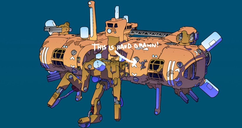
However, figuring out a hand-drawn style that fits well with the rest of the art isn't easy. I have my own style - or styles, but I need to zero in into something more suited for the rest of the art, for a better integration.
(Trying to) Learn from a Master
...And that's when I found Josan Gonzales, aka DeathBurger. As soon as I saw it I was like "yep, I'd like to be able to do that".
Now, obviously I won't be able to do that. Not even close.
But, for what I need, I can focus on a FRACTION of that, some specific approaches to the side content of his incredible illustrations, which would work even better for me, and they are (hopefully) within my reach.
As an example, starting with this excellent piece:
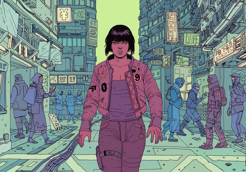
There's a lot, but I would need to do something with the scope of ... just one of the background characters, meant to fit in a poker-size card, for which I can take more time, and of course a less exceptional result.
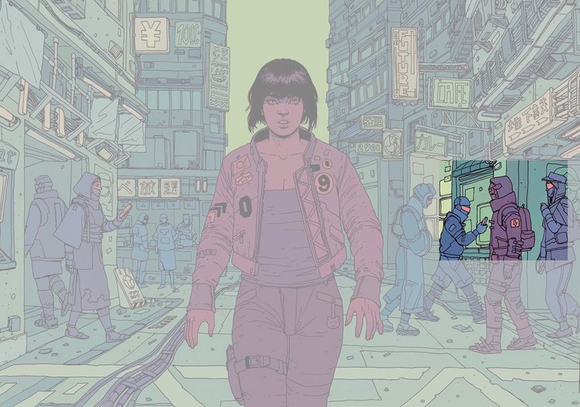
With this in mind - there is a LOT to learn about line economy, dynamics, composition, color management, and detail language from every image of Josan.
My first Take
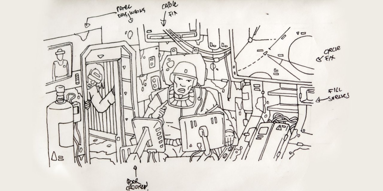
So I started drawing, trying to learn from his pieces, and clearly I am just scratching the surface. I filled a few pages of a notebook, and then tried a first small composition.
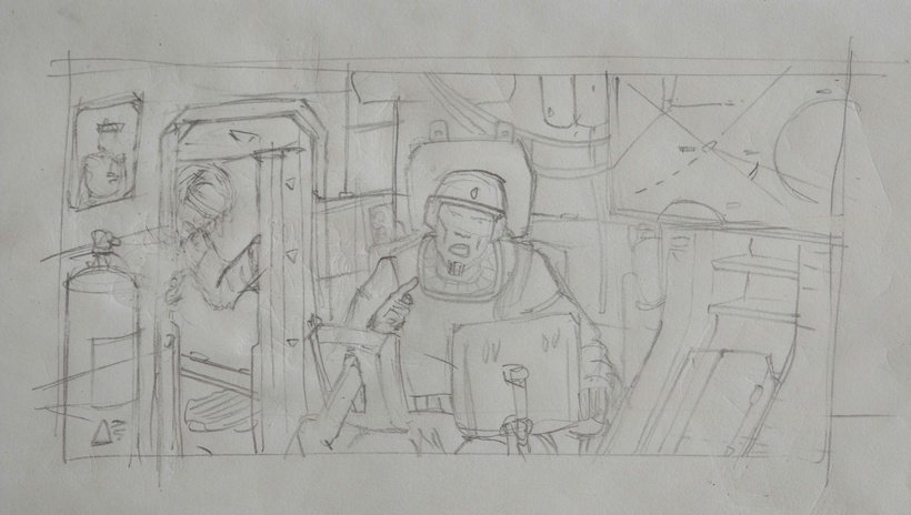
It's... not great. But I would rather bring it to a finished state, and if necessary re-do it later on.
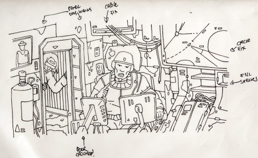
Inking is always fun, even when done quickly on a Moleskine small journal. Again, plenty of rushed choices, but getting to a first completed point is a good start.
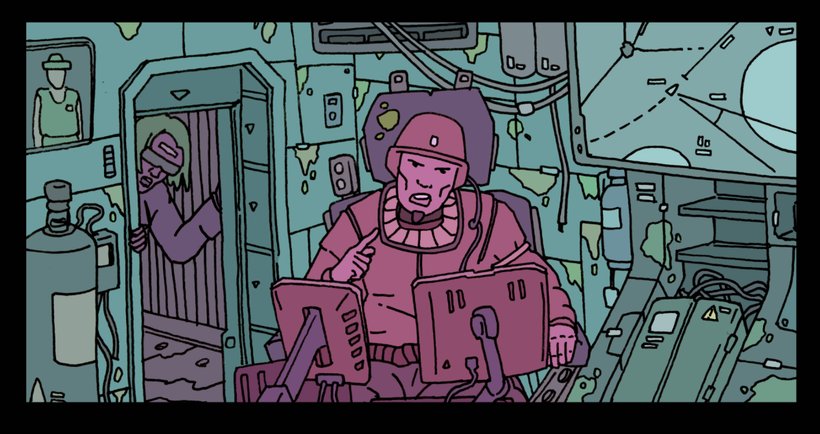
First Conclusions
The result worked ...ok. I don't think I'd use this in the Overdrive cards, but I like the feel of the piece. Things i would change are:
-> Lines should be slightly thinner, and more solid. The .3 liner turned out to be too chubby for the size of theart. A good solution is probably to draw these on an A4 sheet instead, keeping the same line density, but resulting in sharper and clearer lines.
-> Reduce the detail density: I always have a horror vacui and try to fill any flat area... which works ok for the spaceships, but not so much for 2d illustrations. Flat spaces aren't bad, especially when printed on a 3 inches wide card.
-> Integrating the 3D elements also would work well: some of hte industrial components could use some better perspective and cleaner lines. I can always mess them a bit later on.
That said - a fun side-project that piles up on the ever-growing project that is Overdrive!